Surplus Funds Recovery Firm Websites Portfolio
Our portfolio showcases custom-built websites designed to meet the specific needs of surplus funds recovery businesses. Our websites feature interfaces for easy navigation and helps you stand out from the crowd.


01
Enterprise Plan
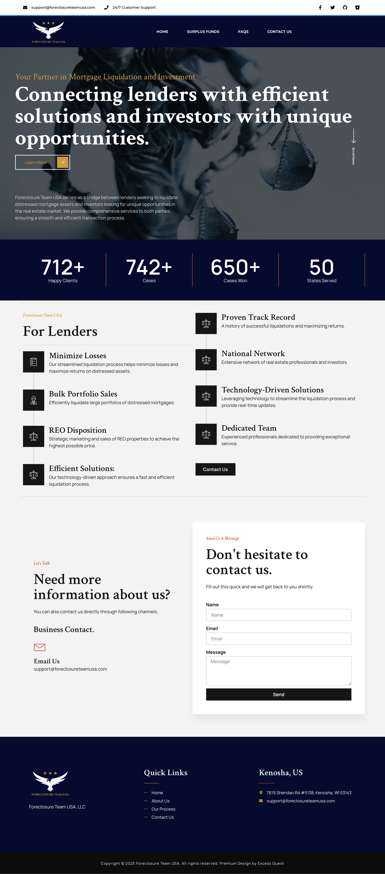
We collaborated with Foreclosure Team USA to design a website that effectively showcases their foreclosure surplus funds recovery assistance and lender support services. Our team helped refine their brand identity, incorporating a professional blue and gold corporate theme to establish trust and credibility.
02
Gold Plan
We partnered with Surplus Funds Recovery Group to develop a professional and user-friendly website that highlights their expertise in helping homeowners claim surplus funds after foreclosure. The design reflects their commitment to transparency and efficiency, with a clean and structured layout. Our team also assisted in refining their branding elements to enhance trust and credibility in the surplus funds recovery industry.


03
Enterprise Plan
For Capitol Asset Recovery Group, we designed a website that reflects the patriotic values of the client, a veteran dedicated to helping homeowners reclaim surplus funds. Incorporating a red, white, and blue theme, we crafted a bold and authoritative design that emphasizes trust, integrity, and service.
04
Enterprise Plan
For Holmes Research Group, we crafted a sleek and investigative-themed website inspired by the Sherlock Holmes TV show, as per the client’s vision. Our team designed a custom logo and website with a detective-inspired aesthetic, combining a clean, professional layout with subtle investigative elements. The result is a visually engaging platform that reinforces their expertise in surplus funds research and recovery while maintaining a sharp and authoritative look.


05
Enterprise Plan
For Dawson Resolutions, we designed a bold and professional website incorporating a red and blue color scheme, reflecting strength, trust, and reliability. The layout is clean and intuitive, ensuring visitors can easily navigate their surplus funds recovery services. Our team worked closely with the client to create a design that enhances credibility while maintaining a modern and authoritative presence in the industry.
06
Gold Plan
For Surplus Refund Solutions, we designed a clean and refreshing website using a green and white color scheme, symbolizing a fresh start after foreclosure. The design emphasizes trust, renewal, and financial recovery, making it easy for homeowners to navigate their surplus funds recovery process. Our team ensured a modern, user-friendly layout that reflects the client’s mission of helping individuals reclaim what’s rightfully theirs.


07
Gold Plan
For 365 Asset Recovery, we created a modern and professional website. The design ensures a user-friendly experience, making it easy for homeowners to understand their surplus funds recovery options.
In addition to the website, we also designed a custom animation video to visually explain the surplus recovery process, enhancing engagement and trust.
08
Silver Plan
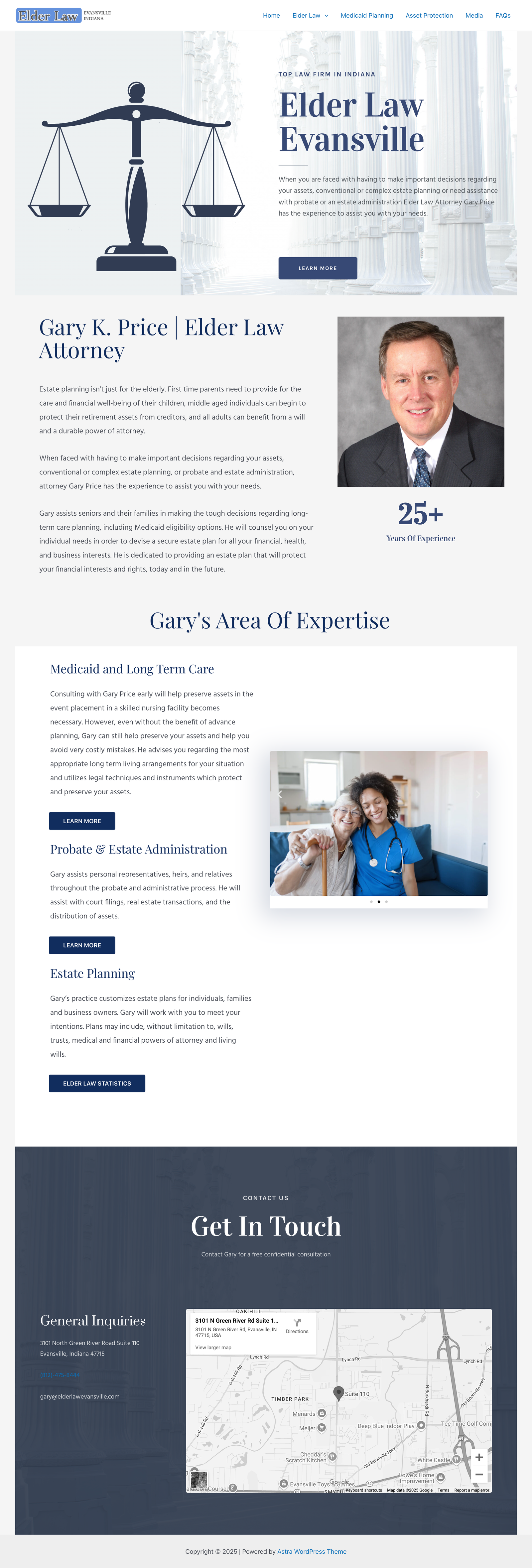
For Elder Law Evansville, we helped recover and rebuild their website after their previous hosting company went out of business, causing them to lose access. Using archived data from multiple sources, we were able to restore their essential content and structure while giving the site a modernized, refreshed design.


09
Silver Plan
For Trusted Recovery Group, a veteran-owned surplus funds recovery business, we designed a professional and authoritative website featuring a blue and gold color scheme to reflect trust, integrity, and service. The website’s structure emphasizes clarity, reliability, and ease of navigation, ensuring homeowners can quickly understand the surplus recovery process.
10
Loyal Customer Upgrade
For Refund To be Claimed, we stepped in to upgrade their website at no additional cost after they were left with an outdated, cluttered design from a company that charged them a hefty fee. Their old site had disorganized pages, poor readability, and an overall structure that didn’t reflect their business well. Since they are already using our lead generation and VA services, we made it our priority to ensure their online presence aligns with their success. Our free upgrade provided them with a modern, clean, and user-friendly website, making it easier for potential clients to engage and trust their brand.


11
Enterprise Plan
We worked with Pluto Asset Recovery to redesign their website, delivering a premium design that aligns perfectly with their brand. A custom logo was developed to reflect the unique identity of Pluto Asset Recovery, and the site features a dynamic running bar showcasing funds recovered for homeowners, using a refined combination of gold and blue.
12
Gold Plan
We built a new website for Surplus Recovery Firm, embracing a fresh combination of green and blue to create a modern, minimalist look that aligns perfectly with the client’s vision. The design is sleek and clean, focusing on simplicity and clarity to enhance user experience. Every element, from the typography to the layout, was carefully chosen to ensure the website is both visually appealing and easy to navigate for homeowners

Our Design Process
At Excess Quest we follow a detailed process to ensure every surplus funds recovery firm, specialist, or attorney gets a custom-branded website that truly represents their business and values
Client Discovery & Brand Preferences
We start by sending a design intake form where clients provide details about their preferences. This includes their favorite websites for inspiration, preferred color schemes, and any logo ideas or reference styles they have in mind.
Logo Design & Branding
Once we receive the form, our designers begin creating five to six custom logo concepts based on the client's input. After reviewing the options, the client selects and approves one logo, which then becomes the foundation for the website’s branding.
Website Development & Design
With the approved branding and logo, we move on to designing and developing the website. The design is tailored to the client’s business needs while maintaining a professional and visually appealing layout. The website is built to be mobile-friendly, fast-loading, and structured for search engine optimization.
Client Review & Final Revisions
Once the website is designed, we send it to the client for review. At this stage, the client can request edits or modifications to ensure the final version aligns with their expectations.
Final Delivery & Launch
After approval, we finalize the website and launch it. The website is now live and ready for business.
Timeline
The entire process is typically completed within a week, but this depends on how quickly the client provides feedback during each stage.
Reviews from Satisfied Clients


Leads Delivered
Custom Websites Built
Cold Calls Made by VAs
Surplus Firms Helped
Trusted by hundreds of Surplus Recovery Firms, Attorneys, Coaches & Students


Get Started Today!
Ready to build a website that boosts your credibility and converts leads into clients? Let’s discuss your vision and create a roadmap to help grow your business.
Quick Links
Contact Us
Let’s Connect – Your Questions Deserve Answers
© Proudly Built by Excess Quest. All Rights Reserved. 2021-2024


